### Overview
Step 1: Choose a system theme
Step 2: Customize your theme
Step 3 : Apply or save your theme
Instructor details, Favicon, and Logo**:**
Overview
You can now customize the feel of your product pages using handpicked themes. Themes help you establish a custom brand identity and experience.
The customizations allow you to add a variety of styles to the products. Check out the help article below for more info on how to customize your memberships.
Step 1: Choose a system theme
Creating a product will by default select the classic theme, but we provide different system themes to choose from to best match your digital product with your personal brand! Keep in mind that each Theme will provide a different look, feel, and overall experience for your Members
How to select a theme
- Select the Product you wish to apply a theme
- Click Customize
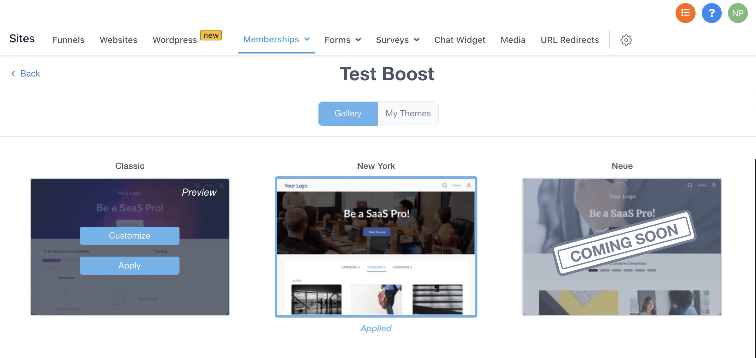
- Theme gallery is the placeholder for system themes which is part of this release and user-created themes (My Themes) will be coming in subsequent releases. Theme gallery allows users to apply a theme or customize an existing theme.
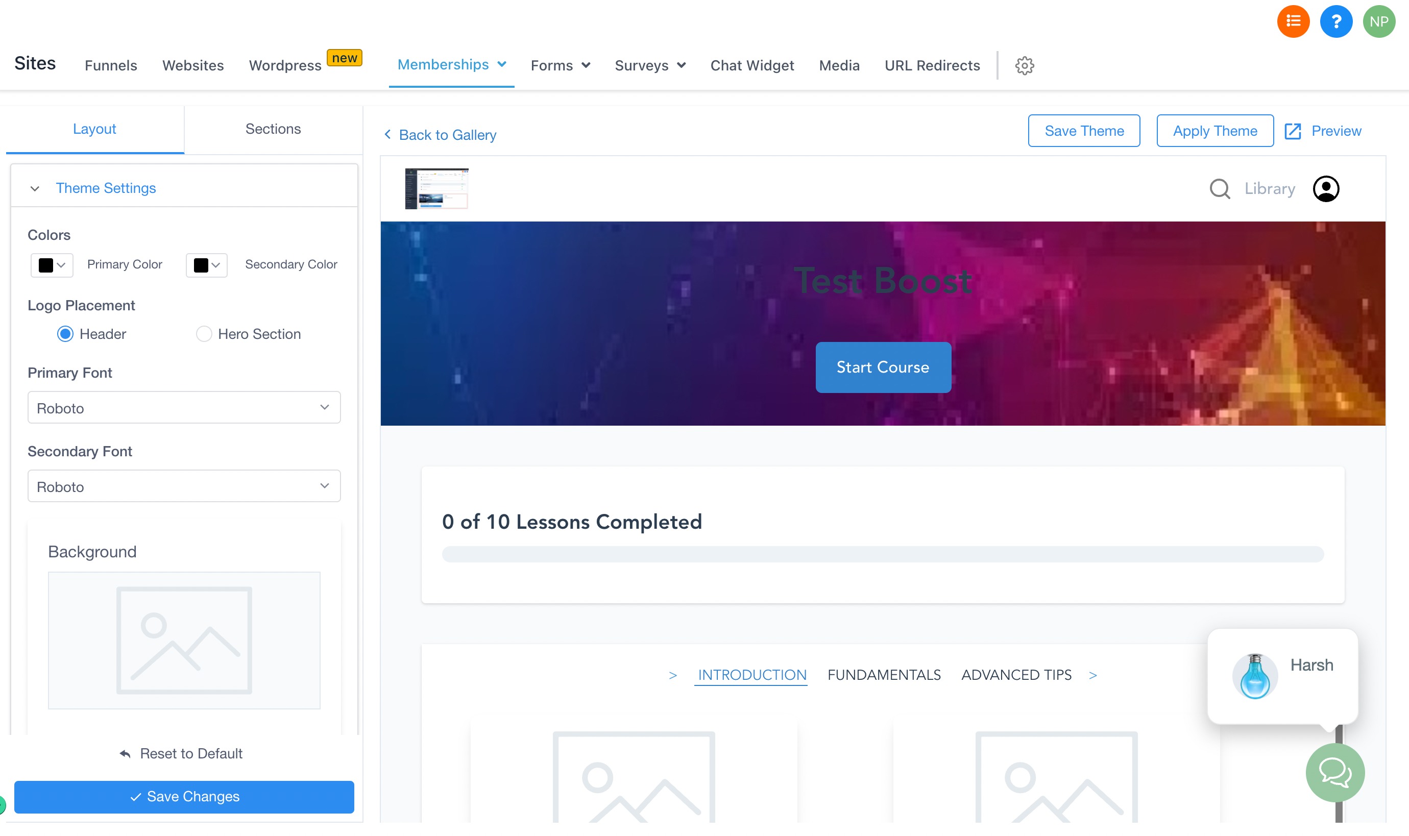
Step 2: Customize your theme
Customize the product page of the theme
- In the theme, gallery click on customize to open the customizations builder.
- Customize the theme settings.
- To customize the sections of your page, simply click into the Section you would like to edit in the sidebar editor on the left-hand side. Once you have clicked inside of a section, you can see all of the different customization options laid out.
The following set of properties can be changed under theme settings
1. Primary Color - This Applies to Button, Top Icons, Lesson Progress, Course Title, Category Title, Lesson title, Instructor Title
2. Secondary Color - Instructor Name, Instructor Description, Lesson Description, Category Description, Button Text
3. Primary Font - This Applies to Button, Top Icons, Lesson Progress, Course Title, Category Title, Lesson title, Instructor Title
4. Secondary Font - Instructor Name, Instructor Bio, Lesson Description, Category Description, Button Text
5. Logo placement - It decides if the logo will be placed in the header or hero section
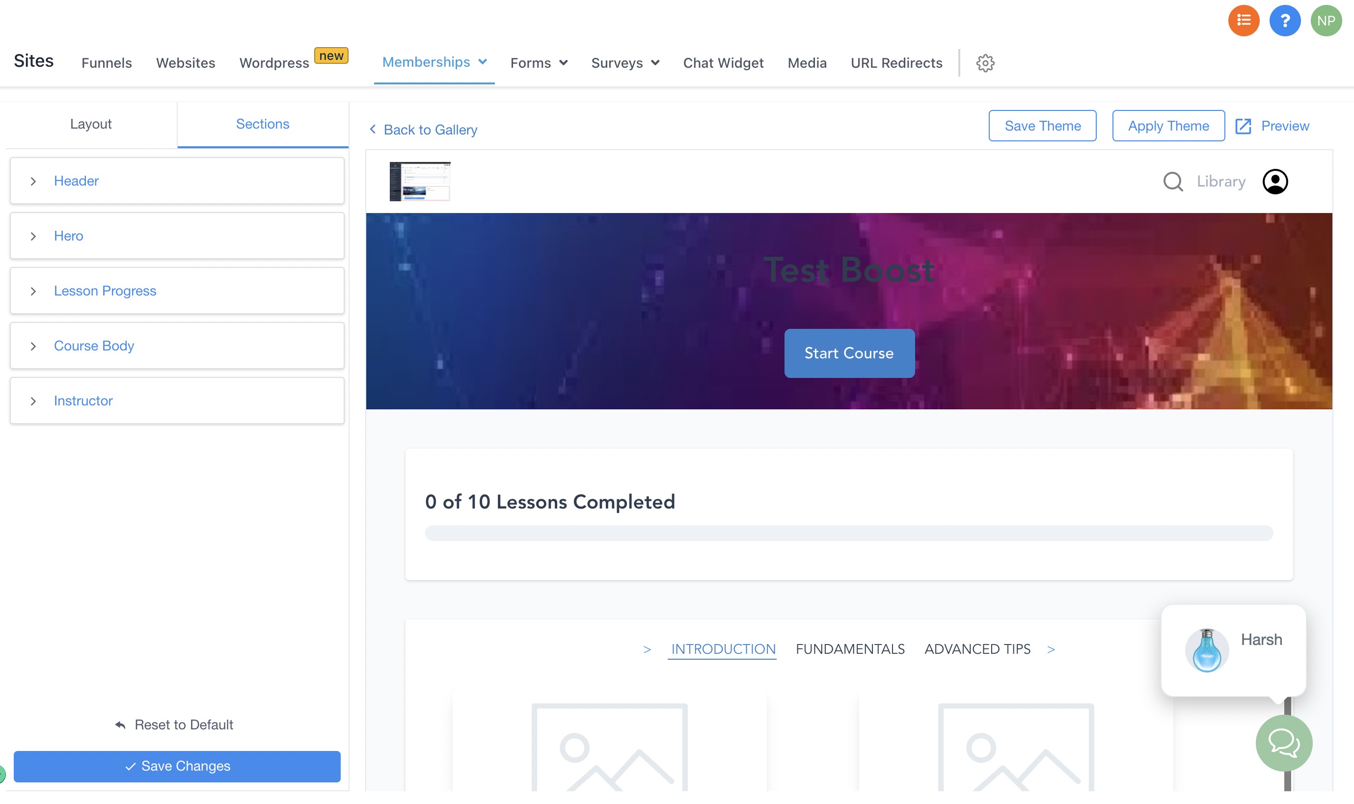
The following set of properties can be changed under Sections
- Header: Navigation:
Sites->Membership->Products->Customize->Gallery>Customize>Sections—> Header
Background:
Background color picker
Alignment:
Can be left, Right or Center
- Hero Navigation:
Sites->Membership->Products->Customize->Gallery>Customize>Sections—> Hero
Size:
Extra Small, Small, Medium, Large
Course Title:
Font, Alignment
Course Description:
Font, Alignment
Background:
Image-Size Dev team, Transparency, Color Picker
Button:
Content, Font, BG Color, Alignment
- Lesson Progress Navigation:
Sites->Membership->Products->Customize->Gallery>Customize>Sections—> Lesson
Progress
Background:
Color
Font
Progress Color:
Colour
- Course Body Navigation:
Sites->Membership->Products->Customize->Gallery>Customize>Sections—> Course Body
Category Font:
Type
Size
Colour
Sub Category Font:
Type
Colour
Size
Category Description Font:
Type
Colour
Size
Lesson Font:
Type
Colour
Size
Lesson Description Font:
Type
Colour
Size
Background:
Image
Color, Transparency
- Instructor Navigation:
Sites->Membership->Products->Customize->Gallery>Customize>Sections—> Instructor
Background:
Color
Heading Font:
Colour
Type
Size
Name Font:
Colour
Type
Size
Title Font:
Colour